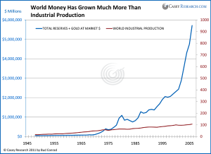
Another way to measure the debasement of the world’s currencies is to compare global industrial production to the global quantity of currency in circulation. As you can see in the next chart, industrial production has only moderately increased over time. Since Nixon closed the gold window in 1971, the quantity of currency in which that output is priced has grown exponentially. Is it any wonder that the nominal price of the average car has soared from $3,542 in 1971 to almost $30,000 today?
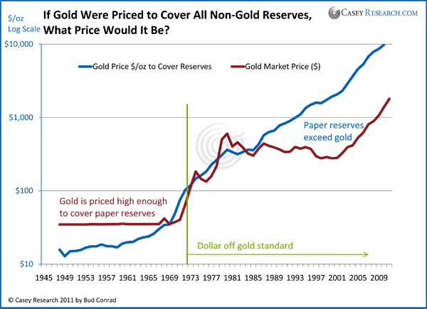
Of course, the price of gold as measured in these currencies has increased over time. At least in theory, the ratio of the dollar value of gold to the dollar value of all currencies in the world, shown in the next chart, should give us a basic measure as to whether gold is overpriced.
As you can see, gold would need to trade closer to $10,000 per ounce to cover all the paper issued over the period. This confirms, in my mind, that although gold is rising rapidly towards $2,000 an ounce, gold investors need not fear that it is in a bubble or that its upward momentum is nearing an end.
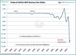
Federal Government Deficits Are “Beyond the Point of No Return”
The government’s debt has accumulated to an amount so enormous that it won’t ever be paid back. The annual deficit is unmanageable as Democrats cry for more spending and Republicans want to continue tax cuts. The chart below shows that the current deficit is at a completely new level, even in comparison to the two world wars.
Looking at the future of government deficits, the Congressional Budget Office (CBO) starts with a baseline projection of the expected government budget deficit based solely on laws already enacted. In other words, the baseline doesn’t account for new laws, which invariably expand spending. Not surprisingly, as you can see in the chart here of previously published baseline forecasts, the CBO’s deficit projections are always optimistic about the expected deficit.
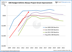
For a look at a more reasonable assessment of the impact of yet-to-be-enacted legislation on future deficits, we turn to a set of data assembled by the Concord Coalition that show much higher deficits going forward. Here are the modifications that underpin what they call a “plausible” scenario:
The CBO baseline is adjusted to assume appropriations increase at the same rate as the economy (GDP growth). This increase is closer to the historical average rate of increase. They assume that supplemental appropriations do not continue indefinitely. For the wars in Iraq and Afghanistan, troop levels slowly decrease to about one-third of their level at the time of the estimate. They assume that Medicare physician payment cuts (under the Sustainable Growth Rate (SGR) are postponed, as they have been for the last several years.
The major tax cuts are assumed to extend beyond 2010. One-year patches to the Alternative Minimum Tax are enacted, holding the level of taxpayers hit by the tax roughly constant throughout the baseline period. A calculation for the increased debt service (interest payments) that these policies cause is added.
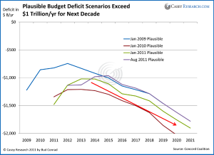
As bad as are the resulting deficit forecasts, however, the assumptions behind even these “plausible” scenarios are so far off from my expectations that I am confident they err on the side of being much too conservative. For example, in the Concord Coalition’s assumptions, the Consumer Price Index never rises above 2.3% – all the way out to 2021 – and the unemployment rate drops to 5.4% by 2016. Along the same optimistic lines, 10-year Treasury interest rates never climb above 5.3% and GDP will reach 5% in real terms by 2015.
While no one can see the future, all of my work leads me to expect much higher inflation, much higher interest rates and a much slower growth of GDP over the time period.
And I can think of worse scenarios, like a recession that cuts tax revenue and higher interest rates that cost more to service the government’s debt. The expansion of war to Libya and Pakistan, and a comment from Obama that the Syrian president “must go” indicate that military spending will continue to be high.
My point is that even under the CBO’s Pollyanna projections, US deficits ensure that total debt continues to rise into increasingly dangerous territory – but actual deficits are likely to be much worse than those projections, and quite possibly devastatingly so. Deficits debase the dollar and are bullish for gold.
The economic situation in the US is declining rapidly, with zero net jobs created for August and the numbers from the previous month adjusted to show a further loss of 58,000. And even those dismal numbers understate things: embedded in the latest report were 81,000 jobs added from a flawed birth/death model that estimates new jobs from small business.
Elsewhere in the economy, housing prices remain weak and consumer confidence has turned down sharply.
The likelihood of continued recession adds to the deficits by decreasing taxes and increasing demands for government spending on unemployment and stimulus.
Adding it all together, it becomes clear that the trajectory for government deficits, and therefore more debt, is to continue to go up, and dangerously so.
The Fed Papered over the Private Debt Crisis But Is Creating Future Inflation
The Federal Reserve jumped into the credit crisis with both feet, tripling its balance sheet since 2008. It did this by creating deposits at the Federal Reserve out of thin air to buy mortgage-backed securities and Treasuries to the tune of $1.6 trillion. Historically, when the Fed paid no interest on deposits, banks would draw down these new deposits to lend out to borrowers in order to make a return, expanding the money supply in the process. By expanding credit, this process also can help prime the economy. That hasn’t happened this time around, and credit has not grown in the private sector.
The deposits at the Fed are obvious in the chart below. Banks receive 0.25% interest on the deposits, which is better than they can currently earn with short-term loans and T-bills, so the Fed has $1.6 trillion of deposits it never had before.
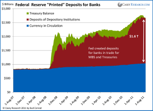
It is helpful to understand the details of what we call printing money and the physical paper money in circulation. The chart above shows that the outstanding currency in circulation (blue area of the chart) is growing at a relatively slow rate. The amount of paper money is not really decided on by the Fed; it is the result of the preference of the population to carry cash as opposed to having deposits at their bank. When people withdraw cash, as they do around the Christmas holidays, for example, the demand for paper dollars increases at the commercial banks. A commercial bank can send a Brinks truck to the Fed, ask for more dollar bills and have the Fed decrease its account at the central bank. In other words, the process is not driven by the Fed but the consumers and the banks.
If the Fed wants inflation, stopping the interest-rate subsidy of paying interest on deposits to the banks would be a good place to start. Then banks would look for places to loan money and inject it into the system.
The Fed surprised the market by extending its policy of a 0 to 0.25% fed funds rate to mid-2013.
Most people reading that the Federal Reserve plans to maintain current low interest rates out to 2013 probably shrugged and went about their business. But I think it’s important to understand that the only way the Fed will be able to meet its low interest rate pledge is to buy Treasuries with newly created money – essentially printing money to purchase the government’s unending supply of Treasuries. Quantitative easing, anyone?
The big question is whether the policy will have a sizeable effect on markets. The chart below shows the historical jump in the Fed’s combined policy tools that were used to lower rates and bail out financial institutions through a variety of programs. These include the big purchase of mortgage-backed securities (MBS) called QE1 and the large purchase of Treasuries called QE2.
The point of the extrapolation in the chart is to guesstimate how much more money the Fed might need to create to keep the rate extremely low for another two years. By connecting a straight line from the start of the unusual policy tool expansions in late 2008 to today’s number and then extending it to 2013, we can estimate that the policy might require about $1.5 trillion in order to keep the rate low.
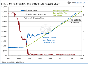
The Fed doesn’t calculate the amount of money that might be required and probably doesn’t know for sure. They just keep buying on the open market until the rate target is reached. If there were a loss of confidence in the dollar, the amount of the purchases required could become very large – and in the extreme, printing more money contributes to that loss of confidence, which in turn causes runaway inflation. We are not there yet. But this kind of open-ended promise is a dangerous precedent because we can’t be sure of the ultimate cost of the commitment. And make no mistake, it is an astounding commitment. At the meeting where the decision was made, even more aggressive operations to expand the money supply were discussed.
