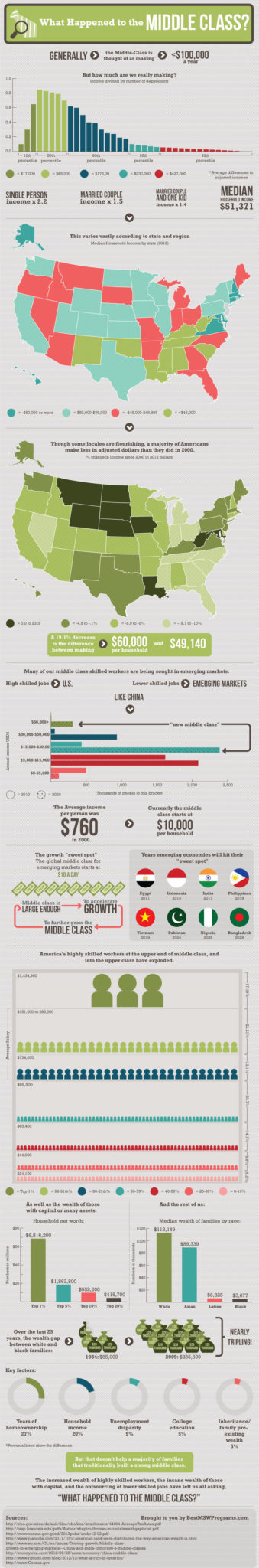
Middle Class Household Income-
Currently, in the United States we consider a family that has a household income of less than $100,000 to be “Middle Class”. But how well are families really doing? According to the 2010 census, the median household income was $51,371. Which means that half the households earn more and half earn less.
But if you break the households up into 5 segments, the first segment, (i.e. the lowest 20% of households) earned about $24,100 before taxes. Households in the middle 5th earned 27% more than the median income or $65,400. Households in the top 20% earned about $239,100 per household. (Click infographic for larger image)
 In a rebound from the beating the economy took in 2008, real average before-tax income grew by 2.7 percent from 2009 to 2010 across all households, but that growth was not uniform across the income distribution.
Income in the bottom 5th grew by 1.2% while household income in the 96th through 99th percentile grew by 3.5% and the top 1% grew by 16%. Of course the top 1% lost the most income during the 2008 crash as well and much of this gain was just recovering what was lost. In fact, among the top 1 percent, income remained well below its prerecession peak.
Income of different segments of the population grow by different rates. For instance the bottom 5th relies heavily on “transfer income” i.e. government subsidies. And transfer income grew by less than 2% in real (inflation adjusted) terms from 2009 to 2010. 2% may sound bad until you realize that wage income, the most important source for households in the lower 80 percent of the distribution, grew by less than 1 percent in real terms from 2009 to 2010.
Emphasizing the importance of investing, real capital gains income rose by 55 percent from 2009 to 2010, although it was still 60 percent below the peak reached in 2007. Dividends grew by 10 percent and business income rebounded by 12 percent. Thus those in the middle class with investments saw their net worth begin to rebound.
Income and Taxes
According to a report by the non-partisan Congressional Budget office, tax revenues declined on non-wage income (such as interest, dividends, and capital gains) because despite a partial recovery in 2010, non-wage income was still low, thus reducing income taxes but not payroll taxes.
The lowest 20% earns only $8,100 which sounds pitiful until you add in $14,200 in transfer payments for Social Security and Medicare and $8,500 for other transfers and subtract zero for Federal Taxes so their average after tax income is $30,800.
Compare that to the next 1/5th which earns $30,700 in “market income*”, gets $10,300 in Security and Medicare and $4,900 in other transfers but pays $2,500 in Federal Taxes for a net after tax income of $43,400.
The next two quintiles would be what we would consider “middle-class” with incomes of less than $100,000. The middle 1/5th earned $54,800 in “market income” received $7,900 in Social Security and Medicare, $2,900 in other transfers and paid $8,100 in Federal taxes for an after tax income of $57,400. So even though they earned 50% more than the 2nd quintile they only got to keep 32% more.
The 4th quintile earned an average of $87,700 in “market income” received $5,500 in Social Security and Medicare, $1,900 in other transfers and paid $16,100 in Federal taxes for an after tax income of $78,900.
The highest 20% (which is skewed wildly by the top 1%) had a “market income” of $234,400 received $5,200 in Social Security and Medicare, $1,300 in other transfers and paid a whopping $58,900 in taxes resulting in an after tax income of $181,900.
*Notes: Market income is composed of labor income, business income, capital gains, capital income, income received in retirement for past services, and other sources of income.
Tax Burden
Those who contend that the rich do not bear their “fair share” of the tax burden should check out the CBO report which shows that the top 20% of households paid 69.3% of the taxes, while the next 20% (fourth quintile) of the population (the upper half of the middle class) paid 18.4% of the taxes. While those who complain about taxes the most i.e. the the 2nd and 3rd quintiles paid 2.8% and 9.2% of the taxes respectively.
At the same time the 2nd quintile received 22.1% of the Social Security and Medicare transfers and 22.8% of the other transfers and the 3rd quintile received 16.7% of the Social Security and Medicare transfers and 13.3% of the other transfers.
Finally, the lowest 20% received 36.2% of the Social Security and Medicare transfers and 47.0% of the other transfers and paid zero taxes.
So How is the Middle Class Doing?
If you kept your job during the recession and had some investments your income and net worth has probably rebounded.
Although the number of American highly skilled workers at the upper end of middle class and into the upper class have exploded, the keys to wealth accumulation is to accumulate assets that will generate passive income. Without income producing assets, your lifestyle is dependent upon continuing to work and it is impossible to get off the job treadmill. The only way for the asset-less to get ahead is to run faster which eventually results in burnout.
In years past, the major asset of the working class was their house and their pension. But increasingly, corporate pensions have been underfunded and have thus morphed into IRA’s and 401k plans. Even government pensions are not entirely secure as government employees of Detroit can attest, as they may only end up receiving 25% of what they expected. Which is why it is imperative to maintain your own diversified portfolio of income producing assets.
Problems with the Infographic:
Looking at net worth we find that the infographic is based on a bit of data by the WSJ. If we look at the WSJ’s source which appears to be the 2010 Family Net Worth Survey by the Federal Reserve the top 10% of households have a median net worth of $1.8 million not $952,200. Those from the 75th to the 90th percentile had a median household net worth of $482,700. Those from the 50th to the 75th percentile had a median household net worth of $157,200. Those from the 25th to the 50th percentile had a median household net worth of $32,200. And those in the bottom 25% had a negative net worth owing an average of $12,800.
But statistics can be strange things. For instance the reason we look at “median” net worth rather than average (i.e. mean) net worth is illustrated by this statistic. In the above Federal Reserve survey we find that the median net worth of a household where the head of household has a college degree is $195,200. but the average of the same group is extremely different at $977,700. So which is “right”? Both are “right” but which one you use depends on either A) How you are trying to skew the data or B) What you are trying to illustrate. The median actually shows you a better picture of how the average person person is doing than the “average” or mean does. Since half the people are worse off and half are better off. If you take the average of 10 people… One person has a net worth of $1, 8 people have a net worth of $100 and one person has a net worth of $1000. Without calculating but based on general feelings, what would you say the average person’s net worth was? $100 right? And the median in this case is $100 because the same number of people are above and below. The average in this case however is $180. because the one high person skews the average. Often if an average is used they will throw out the highest and lowest 1% or something.
In the infographic to the left (click the image to see a larger view) they include data on the “growing racial wealth gap” which says that the wealth gap “nearly triples” from $85,000 in 1984 to $236,500 based on a report done at Brandeis University unfortunately the entire report fails to take inflation into account for the growing racial wealth gap. In actuality if you go to the Inflation calculator and plug in $85,000 and 1984 as the start date and 2009 (the study time period) you will find that according to the U.S. Bureau of Labor Statistics inflation rate based on the CPI-U $85,000 in 1984 is equivalent to $175,511.50 so although the gap grew it did not grow to the extent that the report would lead you to believe and if the BLS is understating inflation there may not be any growth in the gap at all. But the factors they cite as contributing to the “growing racial wealth gap” are certainly important factors in growing your wealth. They include: home ownership, household income, job security, college education, inheritance/ family preexisting wealth. One factor that I would add to the “inheritance” category is the maintenance of a life insurance policy. One of the major problems with lower income families is that although they may buy life insurance they fail to maintain the policy and thus they lose the benefits before collecting on the policy.
You might also like:
- Benjamin Franklin and Compound Interest
- The 100th Anniversary of the Federal Income Tax
- Good News For Income Investors
- Kiss Your Pension Goodbye!
- Investing Defensively
- All Work and No Play for UK’s Future Pensioners
Source: Infographic presented by Bestmswprograms.com
The amount $100,000 as earning for middle class in U.S, its the earning per day, month or?
The article may be a bit unclear, if your whole family makes $51,371/year per household you are “average” if you make over $100,000 you are above middle class. That is why it says less than $100,000 per year is middle class. There are only a handful of people in the world who make $100,000 per day. Definitely not middle class!