By Tim McMahon
Updated May 2, 2026
Current Analysis:
NASDAQ ROC has a buy signal.
Commentary:
In September 2025, the NASDAQ moved back above previous highs, and our ROC generated a Buy signal. By the end of December 2025, the Buy Signal was barely hanging on, but by the end of January 2026, it looked a little more secure and still remains intact.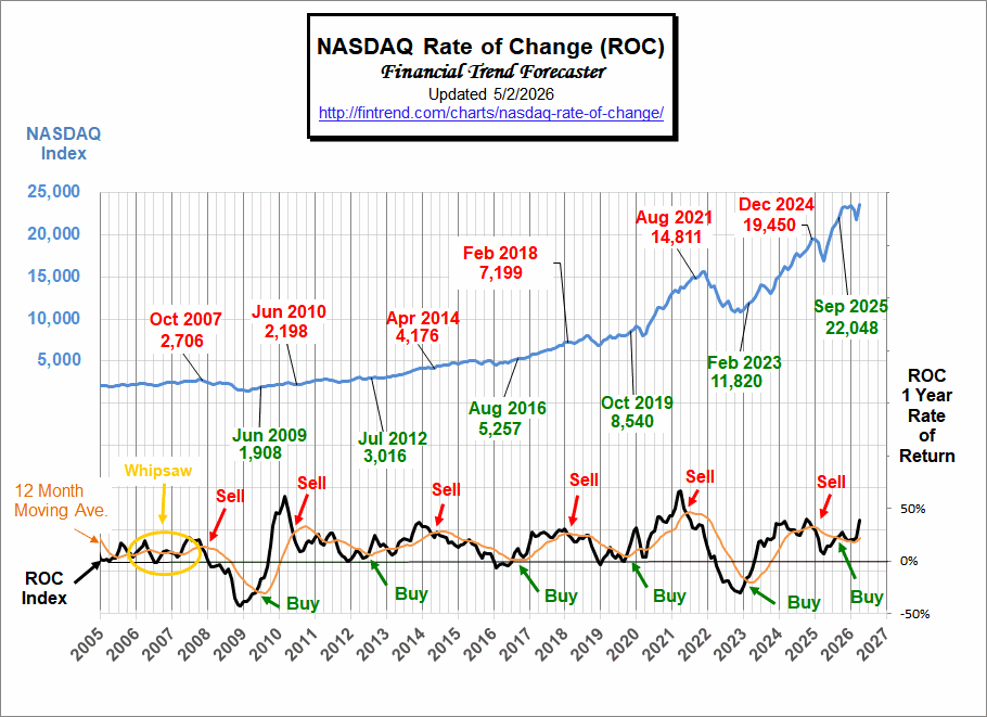
Looking Back:
In August of 2021, our NASDAQ ROC generated a “sell signal.” Three months later, on November 22, 2021, the NASDAQ index peaked at 16,212.
By October 13th, 2022 the index was down to a low of 10,088. By following our sell signal, you would have had 3 months’ advance notice to avoid a 37.7% loss.
Then, in February 2023, both the NASDAQ ROC chart and the NYSE ROC generated a BUY Signal.
In May 2024, the NASDAQ ROC tested its moving average, generating a tentative sell signal. And we said, “But this could still prove to be a false sell signal. So, we should consider it a CAUTION SIGNAL.”
In June, the NASDAQ jumped 6.49%, and the ROC continued to flirt with its moving average, so despite the rise, we stayed in caution mode. But in July, it crossed below its moving average. So, we called it the early stages of a sell signal, which continued in August. But we continued to be cautiously optimistic that this was a false signal. The NASDAQ index itself was still up 24.33% over the previous year’s levels.
In December 2024, the NASDAQ-ROC issued a Sell signal at 19,450, which avoided the April Flash crash.
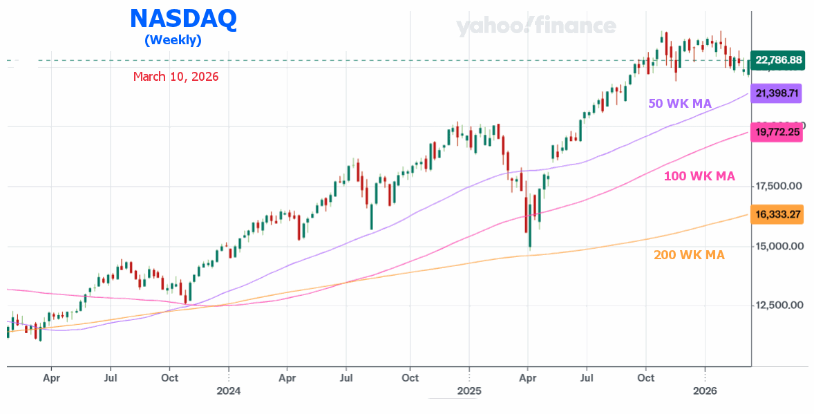
NASDAQ Weekly
On a Weekly basis, the NASDAQ we can see that even though there has been a brief dip it is still well above its 50 Week moving average.
NASDAQ vs. NYSE Performance
Background:
Looking back at November of 2007, the NASDAQ was in the 2700s, and then 14 years later, the NASDAQ was above 16,000 in November 2021, resulting in a 492% gain. Since 2008, the NASDAQ has done a good job of beating the NYSE and the inflation rate. In the chart below, we can see the comparative performance of the NYSE and the NASDAQ. From 2000 – 2002 the NYSE lost about 30% of its value, but the NASDAQ lost over 70% of its value. The NYSE rebounded much better up through 2007, by which time it had more than doubled from its low, massively exceeding its previous high.
The NASDAQ, on the other hand, came nowhere near its previous high. But then, along came the big crash. This time, the NYSE lost roughly 52% of its value, and the NASDAQ lost 47%. By 2015, the NASDAQ had gained roughly 250%, and the NYSE had “only” gained 130%. Since then, the NASDAQ has continued to soar while the NYSE slowly plods along. So, the NYSE outperformed the NASDAQ in the first half of the chart, and the NASDAQ has outperformed since 2008, primarily in the last few years. In late 2021, both were beginning to falter.
Then along came NVIDIA and the A.I. spike of 2023, and in a single month, the NASDAQ tacked on almost 10% to its value. Through the end of 2024, the NASDAQ continued to close the gap with the NYSE.
In 2025, the NASDAQ fell much faster and further than the NYSE. But in May, the NASDAQ also rebounded faster than the NYSE. As of September, the NASDAQ was slightly above the NYSE. But as the War in Iran evolved, the market took a bit more of a “Risk-Off” attitude and the NASDAQ fell back below the NYSE. But now it has rebounded back above the NYSE.
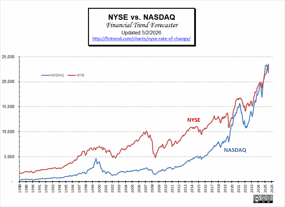
For more information, see the NYSE ROC. Also, see the Inflation-Adjusted NYSE Stock Index.
What is the NASDAQ ROC©?
The NASDAQ Rate of Change (ROC) chart, like the NYSE ROC, helps quickly determine the stock market’s direction.
Once you understand it, you can easily see the direction of the NASDAQ stock market and easily decide whether you want to be in or out (long or short) of the market.
(See Above for Current NASDAQ Analysis)
The NASDAQ Rate of Change (ROC) chart shows the annual rate of return of the NASDAQ market along the left axis and the years since 1990 along the bottom.
Like our NYSE Rate of Change chart, it shows the rate of return, not the current price. The nice thing is that it makes it so much easier to see performance. It is just a matter of whether the index is above or below the zero line… the NASDAQ is up if we are above the zero line… and the NASDAQ is down if we are below.
Of course, you want to exit positions while we are in positive territory (with a gain above the line) rather than waiting until you have a loss. We exit, sit on the sidelines safely with our money intact, and reenter when we get a buy signal. Due to investor psychology, this isn’t easy to do. See: Why Investors Cling to Hope Amid Stock Market Turmoil and Improving Your Investments with Decision Theory for reasons why this is so.
About the Chart
The red line is the 12-month moving average. As with most moving averages, a buy signal is generated as the index crosses above the moving average. And a sell signal is generated as the index crosses below the moving average. (See Current Analysis Below)
Another helpful way to use this chart is to look at the slope of the red moving average line. If the slope is down, the market is trending down (annual gains are getting smaller). If the slope is up, the market is moving up (gains are increasing). And obviously, if the line is basically flat, the market is not trending at all. It is generating a steady return. If this steady return is positive, the market is performing well, and a nice flat, steady return is preferable to a volatile market that may cause you to panic and sell at a loss.
Just because this chart is not moving higher does not mean we should sell. In the period from June 2004 – June 2007, the red moving average line was basically flat, although it had a bit of wiggle, it was still flat at around 10% rate of return, so holding during that period would have produced returns very close to the long-term average.
If you are looking for big gains, the best buy signals come from a movement from below the 0% line. This allows you to capture the greatest up move.
The Chart issued a sell signal in October 2007 with the NASDAQ at 2764. Subsequently, the NASDAQ fell to around 1480. A buy signal was issued at 1796, almost 1000 points below where the sell signal was generated.
Note: While viewing this chart, we must remember that it represents the rate of return we would have earned if we held the entire NASDAQ for the previous 12 months. This can be achieved through the use of an index fund or ETF.
You might also be interested in the correlation between inflation and the stock market? How does decade inflation and stock market returns compare?
See Also: