What is the NYSE Rate of Change (ROC)®?
The NYSE Rate of Change (ROC) chart helps quickly get the “big picture” of the stock market. The old saying “a picture is worth a thousand words” is very applicable to this chart. Once you understand how to read the ROC chart, you can easily spot the direction of the market. This makes it easy for you to know whether you want to be invested (or invest more) in the market or not. (See Below for Current NYSE Analysis)
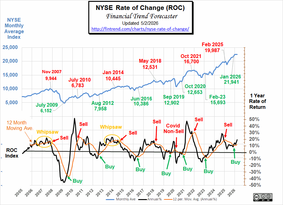 Since this chart shows the rate of return rather than the current price, it is much easier to see market performance. We don’t have to guess if we are up or down from last year. If the ROC is below the zero line… the market is down. If it is above the zero line… the market is up. The key is to exit positions while in positive territory (with a gain) to avoid the loss, and then reenter when we get a buy signal.
The orange line is the 12-month moving average. As with most moving averages, a buy signal is generated as the index crosses above the moving average. A sell signal is generated as the index crosses below the moving average. (See Current Analysis Below)
Another helpful way to use this chart is to look at the slope of the moving average line. If the slope is down, the market is trending down (gains are getting smaller). If the slope is up, the market is moving up (gains are getting bigger). And obviously, if the line is basically flat, the market is not trending at all. But a flat line at the 10% level is not bad; it means the market is gaining a steady 10% a year, which would be very good.
Just because this chart is not moving higher does not mean we should sell. In the period from May 2005 to May 2007, the orange moving average line was basically flat, with a bit of wiggle. However, it was still flat at around a 12% rate of return, so holding during that period would have produced steady returns well above the long-term average. So it would have been difficult to know that the August 07 Sell signal was the real deal. But when it crossed below the zero line in January 2008, it was definitely time to be out of the market. Had you gotten out, then you could still avoid significant losses.
If you are a short-term trader or simply looking for significant gains, the best buy signals come due to a movement from below the 0% line. This allows you to capture the greatest up move.
Note: While viewing this chart, we must remember that it represents the rate of return we would have earned if we had invested in the entire NYSE for the previous 12 months, which can be achieved through the use of an index fund.
Current NYSE-ROC Analysis:
Buy Signal
The ROC charts are designed to tell us the long-term trends and not generate short-term signals. In May, the NYSE was up very slightly, and the NYSE-ROC is still in buy territory.
Looking Back:
Back in October 2021, our NYSE ROC called an official SELL Signal. Three months later, the market peaked at 17,442 on January 13th, 2022, and then over the next 12 months it lost roughly 4,000 points.
By February 2023, the NYSE had gained back some of its losses, and the NYSE-ROC crossed above its 12-month moving average, generating a BUY Signal. Had you followed these signals, you could have bought back cheaper and earned interest on your investments for 16 months.
Current Comments:
In February 2025, the NYSE ROC crossed below its moving average, generating a sell signal. The market peaked with a monthly average of 19,987, and our sell signal avoided the big April correction. Despite the NYSE making new highs, the ROC stubbornly refused to shake off that drop and generate a new buy signal until January 2026. As of June 2026, the NYSE ROC remains in Buy territory.

Note: In 2020, the ROC generated a COVID sell signal, which we suggested ignoring. This turned out to be the correct move since the correction, although steep, was very short-lived.
NYSE Composite Chart
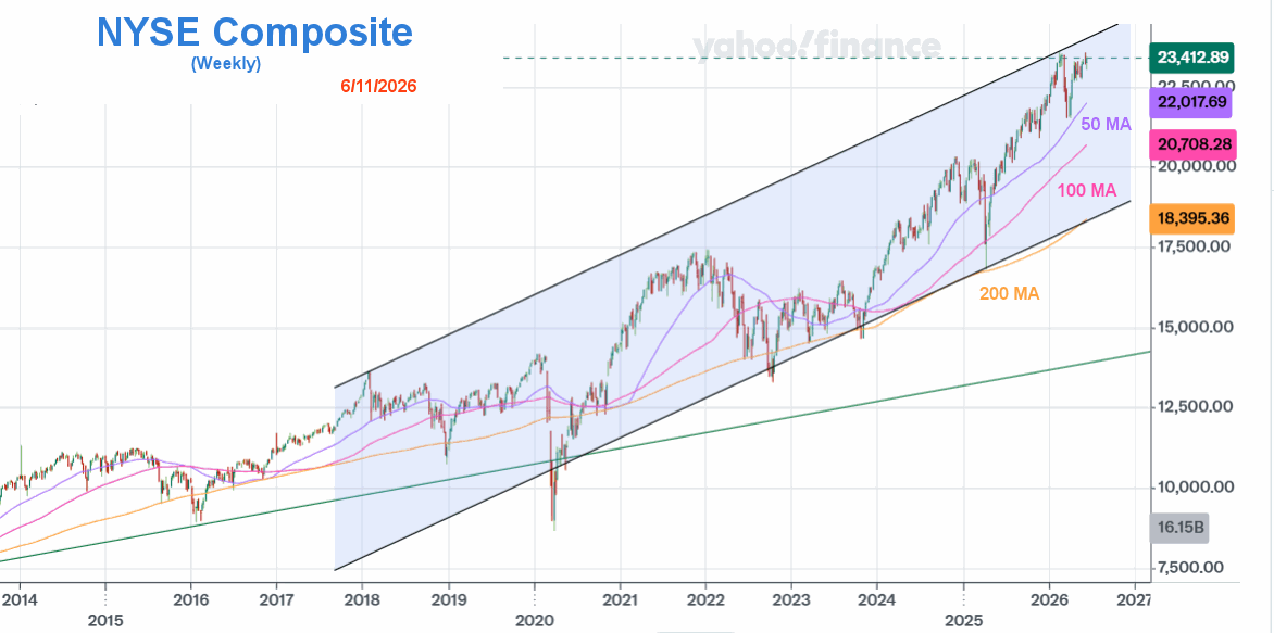 Way back around 2016, the market shifted into “overdrive.” We can see that the green line was the previous angle of ascent. But beginning in 2016, the angle began to subtly shift upward. So, I’ve decided to create a new channel to accommodate the new reality. Typically, angles of ascent this steep don’t last this long. But here we are. The market appears to be taking a bit of a breather this week, struggling to break above the previous high from back at the end of February. The NASDAQ, on the other hand, is way above February levels and has drastically outperformed the NYSE.
NYSE vs. NASDAQ
Over the years, beginning around 2020 and the advent of AI, the NASDAQ has caught up with the NYSE, and now it is well above the NYSE.
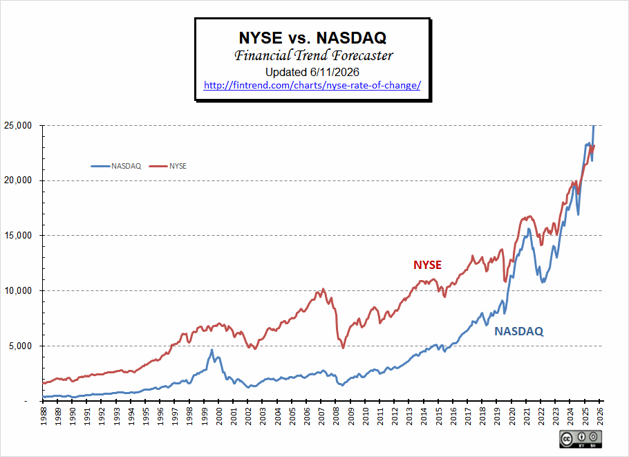 Typically, the NASDAQ falls first as investors limit risk by switching to “blue chips”, and then both fall in tandem. And in March 2025, we saw the NASDAQ take a sharp dive while the NYSE was only down slightly. But in May, we saw a sharp rebound in the NASDAQ and a more subdued rebound in the NYSE, indicating that the market was returning to a “Risk-on” stance. In July 2025, the NASDAQ monthly average slightly exceeded the NYSE. Through December, the NASDAQ continued to outperform the NYSE. Then briefly, the NASDAQ was above the NYSE.
See FED Actions & M2 Money Supply and FED Interest Rates for more information.
NYSE Rate of Change (ROC) History:
Background:
Back in September 2017, with the NYSE at 12,080, the ROC issued what appears in hindsight to be a Sell signal, but at the time, we called it a Hold. Subsequently, the NYSE fell about 1,000 points but rapidly rebounded, so the “hold” call was correct.
After passing a milestone in February 2020 of doubling since the September 2011 low (up 108.8%), the market was panicked into a massive “correction” by a combination of COVID-19 and falling oil prices. This generated what looked like another sell signal. And once again, we chose to hold through it, predicting a rapid rebound, which is precisely what happened.
In March 2020, the NYSE lost over -20% of its value. Then in April, it lost another -1.4%. At that point, it was only down -13.6% from the previous year’s levels (due to increases prior to the crash).
Then, more than a year after the COVID crash, it APPEARED that the NYSE ROC had skyrocketed to an impressive 45% above previous levels. But that is primarily because the crash and recovery were so “V” shaped. The ROC measures against year-ago levels, which means that had you bought in May 2020, you would be up about 45% a year later. But had you bought in February 2020, you would “only” be up 15.7% by May 2021. This is still a respectable return, but a far cry from 45%.
In September 2021, the NYSE was up 30.92% above September 2020 levels. But that is primarily because we are comparing against recovering 2020 levels. Compared to February 2020, the market was up 17.67%.
——————————-
Is there a correlation between inflation and the stock market? This chart compares decade inflation and stock market returns during the decade. Also, see the Inflation Adjusted NYSE Stock Index – how has the NYSE fared when inflation is considered?
For more information, see: NASDAQ Rate of Change
Tim McMahon, Editor
Financial Trend Forecaster
Subscribe to our Free E-zine, and we will notify you when this chart is updated.
We issued a buy signal in March ’03, catching the absolute lowest risk entry point. And then got a sell signal in October ’07 before the big drop! Don’t miss our next Signal! Subscribe to our Free E-zine.
Subscribe NOW!
See Also:
- Oil Price Table (Inflation-Adjusted)
- Oil Prices < $40/Barrel?
- Gold vs. Oil Chart
- Quantitative Easing and Inflation