As anyone who has read my articles for any length of time knows, I am a big fan of ratios. I find them very useful for tracking the comparative value of things especially when presented in chart form. Over the years I have tracked the Gold vs Oil ratio, Gasoline vs. Oil, and many more. Generally they are used to target underpriced sectors so you can tell which one is a better investment.
But in today’s article Nico Isaac shows us that by looking at the Gold/Silver ratio we can tell something else and that is how conservative the investing public is.
The Gold/Silver Ratio Shows Investors’ Rapid Flight From Risk
By Nico Isaac
I finally broke down last year and joined Facebook, the world’s largest social networking website (or, as my 80-year old step-aunt calls it, “The Face Page“). Facebook users create their own personality profiles, upload photos, announce events, and most importantly, search for long-lost or new-found acquaintances to “Add” to your “Friends” column.
In turn, a very special weekly (or daily, or hourly) Facebook dialogue ensues: New friends “tag” you in pictures, write on your “wall,” “poke” you to say hello, and “like” comments you’ve posted to your home page.
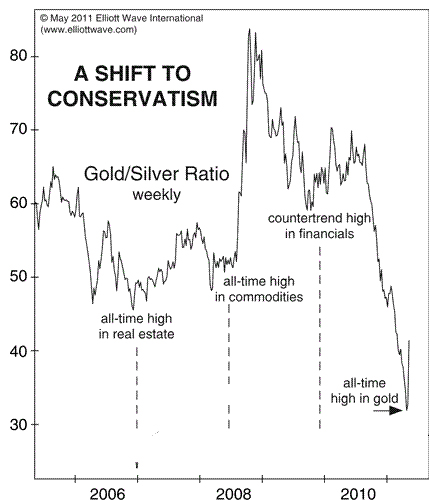
To illustrate this phenomenon, Elliott Wave International’s May 6 Short Term Update presented the following close-up of the Gold/Silver Ratio since 2006.
This index is a time-honored measure of the collective risk-appetite among investors. Simply put, it gauges investors’ preference for the relative safety of the yellow metal by dividing the price for one ounce of gold (x) over the price for the same amount of silver (1). A rising ratio signals a growingly fearful public. A falling ratio signals a growingly fearless one.
You can see that over the past five years, each meaningful upturn in the ratio has coincided with a major market peak: 2006 real estate, 2008 commodities, 2009 financials, and in 2011 a potentially meaningful top in gold.
Flash ahead to the brand-new July 2011 Elliott Wave Financial Forecast. There, our analysts present an updated chart of the same measure (albeit, inverted) alongside this powerful insight:
Over 13 trading days (from an intraday high on April 25 to an interim low on May 11) the gold/silver ratio experienced a 30% sell off, indicating a “rapid flight from risk.” Also, “the turn away from risk did not trigger a major rally in gold.”
Bottom line: a new “status update” is clear: Investors have unfriended Risk.
Are the market’s ‘animal spirits’ peaking? Get the complete story today via ElliottWave International’s risk-free Financial Forecast Service.


Appreciating the time and energy you put into your website and in depth information you present. It’s good to come across a blog every once in a while that isn’t the same old rehashed information. Excellent read! I’ve bookmarked your site and I’m adding your RSS feeds to my Google account.