What is the NYSE Rate of Change (ROC)®?
The NYSE Rate of Change (ROC) chart helps quickly get the “big picture” of the stock market. The old saying “a picture is worth a thousand words” is very applicable to this chart. Once you understand how to read the ROC chart, you can easily spot the direction of the market. This makes it easy for you to know whether you want to be invested in the market or not. (See Below for Current NYSE Analysis)
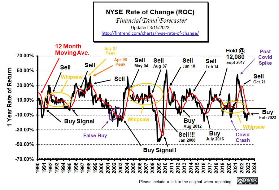 The NYSE Rate of Change (ROC) chart shows the annual rate of return along the left axis and the years since 1990 along the bottom.
Since this chart shows the rate of return rather than the current price, it is much easier to see its performance. We don’t have to guess if we are up or down from last year. If we are below the zero line… we are down. If we are above the zero line… we are up. The key is to exit positions while in positive territory (with a gain). And avoid the loss, then reenter when we get a buy signal.
The red line is the 12-month moving average. As with most moving averages, a buy signal is generated as the index crosses above the moving average. A sell signal is generated as the index crosses below the moving average. (See Current Analysis Below)
Another helpful way to use this chart is to look at the slope of the red moving average line. If the slope is down, the market is trending down (gains are getting smaller). If the slope is up, the market is moving up (gains are getting bigger). And obviously, if the line is basically flat, the market is not trending at all. But a flat line at the 10% level is not bad; it means the market is gaining a steady 10% a year which would be very good.
Just because this chart is not moving higher does not mean we should sell. In the period from May 2005 – May 2007 the red moving average line was basically flat, with a bit of wiggle. However, it was still flat at around a 12% rate of return, so holding during that period would have produced returns well above the long-term average. So it would have been difficult to know that the August 07 Sell signal was the real deal. But when it crossed below the zero-line in January 2008, it was definitely time to be out of the market. Had you gotten out, then you could still avoid significant losses.
If you are a short-term trader or simply looking for significant gains, the best buy signals come due to a movement from below the 0% line. This allows you to capture the greatest up move.
Note: While viewing this chart, we must remember that it represents the rate of return we would have earned if we had invested in the entire NYSE for the previous 12 months, which can be achieved through the use of an index fund.
Prior to the “lower inflation” inspired rally, on November 14th, the NYSE ROC was very near a sell signal. Then the FED gave hints it might be nearing the end of its tightening phase, which extended the rally.
Current NYSE-ROC Analysis:
Caution Signal
Looking Back:
Back in October 2021, Our NYSE ROC called an official SELL Signal. Three months later, the market peaked at 17,442 on January 13th, 2022, and then over the next 12 months it lost roughly 4,000 points.
In February 2023, the NYSE- ROC crossed back above its 12-month moving average, generating a BUY Signal.
Since April 2023, the NYSE is up 17.23%. But last month the ROC’s annual gains peaked at 22.02%. So we see a slight dip in our ROC chart this month. It is still well above the moving average so we don’t have a sell signal yet but caution is warranted we could be nearing the top.
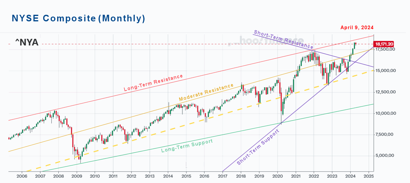
NYSE Composite (Monthly)
Last month we said, “The NYSE is nearing its long-term resistance line so caution is warranted.”
In addition to the ROC’s warning when we look at the monthly chart we see a single down month (red bar) so the market is getting “toppy”. Looking at the last few months we see five up months (green bars) breaking through the Short-Term resistance line. Should the market begin reversing that line will act as support but that could still mean a 16% drop down to around 15,000. Between here and there the yellow line could provide some support.
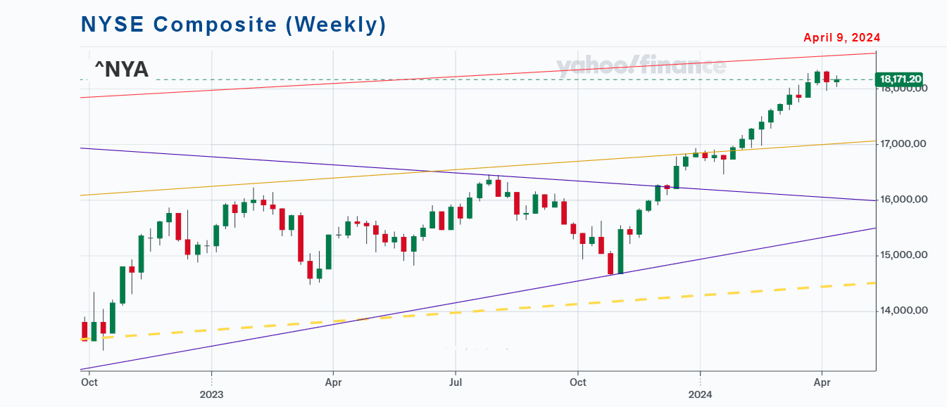
NYSE Composite (Weekly)
Looking at just the last year and a half in weekly terms we can see the run-up and how it ran into resistance at the yellow line but overall it was a nice run, with only a few down weeks. If the rest of April can move up from here it could erase the red bar from the monthly chart and provide the test of the red Long-Term resistance line.
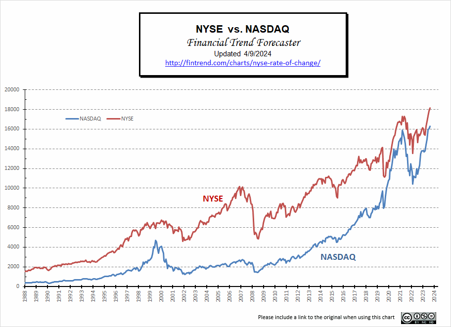
NYSE vs. NASDAQ
Typically, the NASDAQ falls first as investors limit risk by switching to “blue chips”, then both fall in tandem. Uncharacteristically, from 2022-23, the NASDAQ was rebounding while the NYSE was running into resistance. The basic support of the NASDAQ has been provided primarily by A.I. and Tech stocks in the NASDAQ. We can see in this chart how much stronger the NASDAQ has been as it tries to catch up to the NYSE.
FED Actions
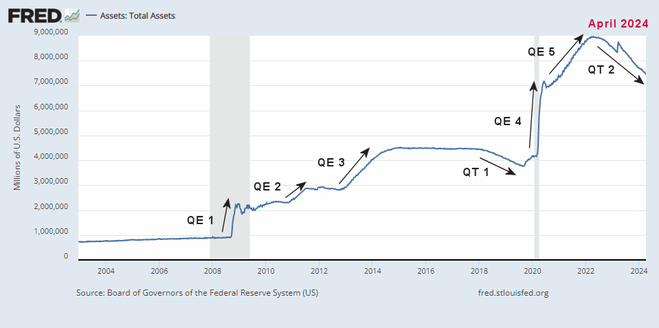
For two years, we were saying that QE5 would take FED assets to $9 Trillion… and they almost got there. Then finally, the FED got its act together and started tightening. This resulted in roughly a 2/3 Trillion decrease (QT2), bottoming at 8.339 Trillion. But then a banking crisis broke out in California, and the FED jumped it back up, wiping out roughly 38% of the gains they made. Since then, the FED has been decreasing assets again. In July, it broke below the March low hitting 8.298 trillion. By September 6th it was 8.101 trillion and by April 3rd it was down to 7.631 trillion. Usually, tightening of this sort will result in a major stock market selloff but we have been fortunate so far. But Mr. Market has been expecting the FED to cut interest rates but that hasn’t happened and the most recent FED report hinted that it may not happen any time soon. So the market is hesitating.
 Source: St. Louis FED
FED Funds Rate
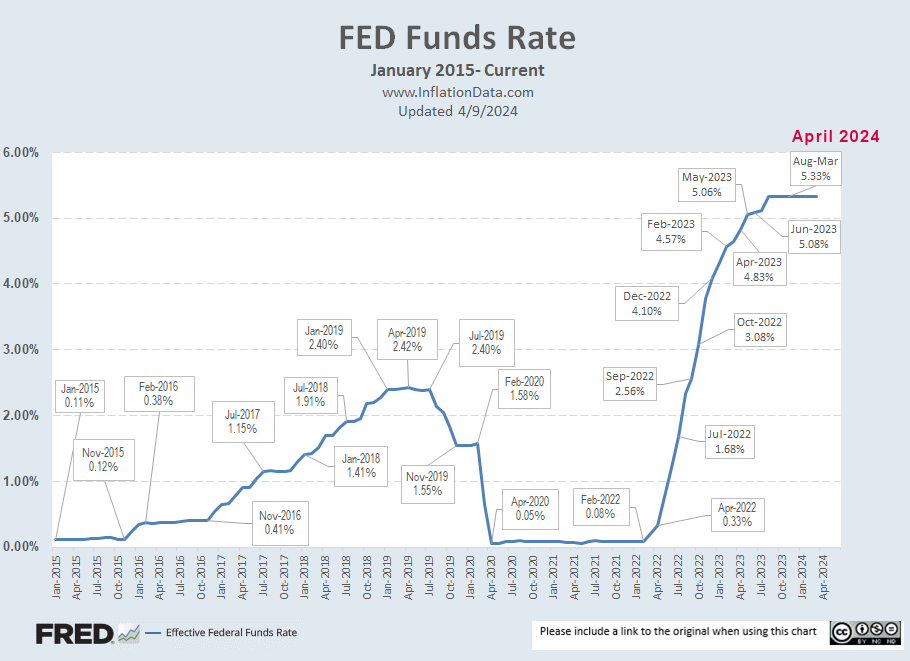
The chart below shows the rapid increase in interest rates. In February 2022, they were just 0.08%… a year later, they were at 4.57%. By the end of May 2023, they were at 5.06% with a FED target of 5% to 5.25%. From August 2022 to August 2023, the rate went from 2.33% to 5.33% with the FEDs recent 1/4% increase in their target rate which has held steady at 5.33% since August. Market participants continue to hope for a rate cut but it has held steady at 5.3% since August.
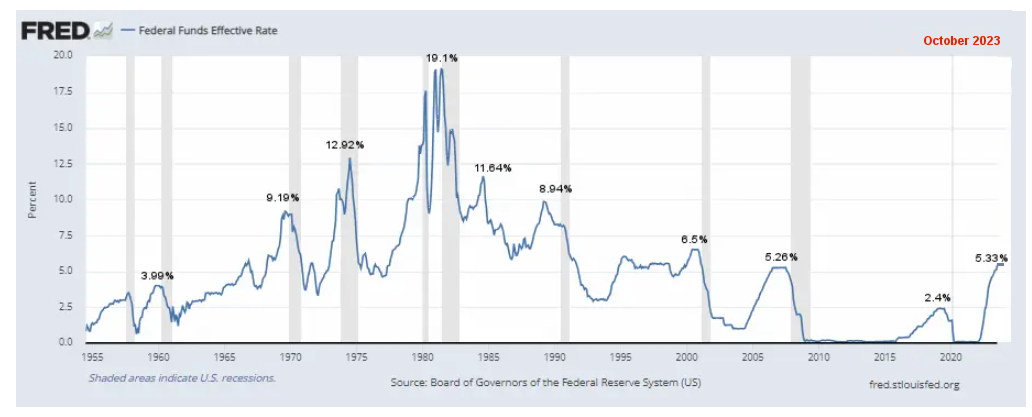
But in the grand scheme of things, rates are still relatively moderate. Looking at the chart since 1954, the FED Funds rate was over 5% as recently as 2008, almost 9% in 1988 and 19.1% in 1981. In this view, we can see that we are just slightly above the average rate since 1954, which is 4.6% and we have just exceeded the 2007 peak of 5.26%. The one warning is that the last two times rates were this high a recession followed before too long.
Data Source: https://fred.stlouisfed.org/series/FEDFUNDS#0
NYSE Rate of Change (ROC) History:
In August 2012, the NYSE ROC generated a definite buy signal, not quite as dramatic as in 2009, but a good buy signal nonetheless. And the rate of return shot up considerably. Then the rate of return bounced around above 10% coming close to the moving average but not crossing below. In the Summer of 2013, FED chairman Bernanke spooked the markets with his talk of backing off the accelerator, but then he decided to take it back, so the markets picked up again. Until September 2013, the red moving average line was trending up, and the index remained above the moving average.
But in September, possibly out of concern over what would happen when Bernanke retired, the black line crossed below the moving average, generating a sell signal. At that point, we asked, “Is this “the sell signal” that signals the end of the bull market? Or will it just be another whipsaw?” We said, “Only time will tell, we are at the end of the summer, and the market may be picking back up again for the winter months.”
In October, it seemed that the market had accepted that the new FED chairman Yellen continued on the easy money path. So, the market picked up again, moving the NYSE once again into buy territory. Then, the market went basically nowhere for the next month, so the annual rate of return dropped from 25.8% to 20.23%. But a 20% annual return is still excellent. Unfortunately, 20% is generally unsustainable, and high returns like that typically indicate overbought conditions and the making of a bubble.”
In February 2014, the rate of return line crossed below its moving average generating a sell signal at around 10,250. And as we saw above, the market lost 19% from May 2015 through February 2016. The ROC then gave another buy signal in July 2016. With the rally actually beginning in February 2016 and August 2017, the index is up 31%. So the ROC indicator follows the old adage of getting out early and getting in late for the safest returns. We don’t try to get the first 10% or the last 10%; we are happy to get the 80% in the middle.
Background:
Back in September 2017, with the NYSE at 12,080, the ROC issued what appears in hindsight to be a Sell signal, but at the time, we called it a Hold. Subsequently, the NYSE fell about 1,000 points but rapidly rebounded, so the “hold” call was correct. Then, not surprisingly, with all that has happened, 2020 was a giant rollercoaster ride (aka. whipsaw) for the NYSE.
After passing a milestone in February 2020 of doubling since the September 2011 low (up 108.8%), the market was panicked into a massive “correction” by a combination of the Corona Virus (COVID-19) and falling oil prices. This generated what looked like another sell signal. And once again, we chose to hold through it, predicting a rapid rebound, which is precisely what happened.
In March 2020, the NYSE lost over -20% of its value. Then in April, it lost another -1.4%. At that point, it was only down -13.6% from the previous year’s levels (due to increases prior to the crash).
Then more than a year after the COVID crash, it APPEARED that the NYSE ROC had skyrocketed to an impressive 45% above previous levels. But that is primarily because the crash and recovery were so “V” shaped. The ROC measures against year-ago levels, which means that had you bought in May 2020, you would be up about 45% a year later. But had you bought in February 2020, you would “only” be up 15.7% by May 2021. This is still a respectable return but a far cry from 45%.
In September 2021, the NYSE was up 30.92% above September 2020 levels. But that is primarily because we are comparing against recovering 2020 levels. Compared to February 2020, the market was up 17.67%.
In October, the index was down -1.16% on a monthly basis. Thus putting the NYSE ROC in Sell territory (i.e., barely crossing below the moving average). November erased those losses with a 5.14% gain on the month, but that was short-lived. December lost -2.93% giving us a clear sell signal.
——————————-
Is there a correlation between inflation and the stock market? This chart compares decade inflation and stock market returns during the decade. Also, see the Inflation Adjusted NYSE Stock Index – how has the NYSE fared when inflation is considered?
For more information, see: NASDAQ Rate of Change
Tim McMahon, Editor
Financial Trend Forecaster
Subscribe to our Free E-zine, and we will notify you when this chart is updated.
We issued a buy signal in March ’03, catching the absolute lowest risk entry point. And then got a sell signal in October ’07 before the big drop! Don’t miss our next Signal! Subscribe to our Free E-zine.
Subscribe NOW!
See Also: