The stock market appears to be approaching an “inflection point.” Mr. Market is going to have to make up his mind… whether this is going to turn into a bullish or bearish market. At this point, it could still go either way, but the big caveat is that when it moves, the move will probably be dramatic. Looking at the following chart, we can see the two blue short-term support and resistance lines are forming a “pennant” formation. Generally, when that happens, it is like a spring being coiled up as the index gets compressed into the two lines. When it finally breaks free in one direction or the other, it is often explosive. The good news is that even if it breaks below the blue short-term support line it will most likely be stopped by the dotted yellow line. And fortunately, the dotted line is trending up, so the new low would still be above the previous low of 13,278 in early October 2022, putting the next low at a minimum of around 14,000. So, we would need a real financial meltdown to take the market below that level.
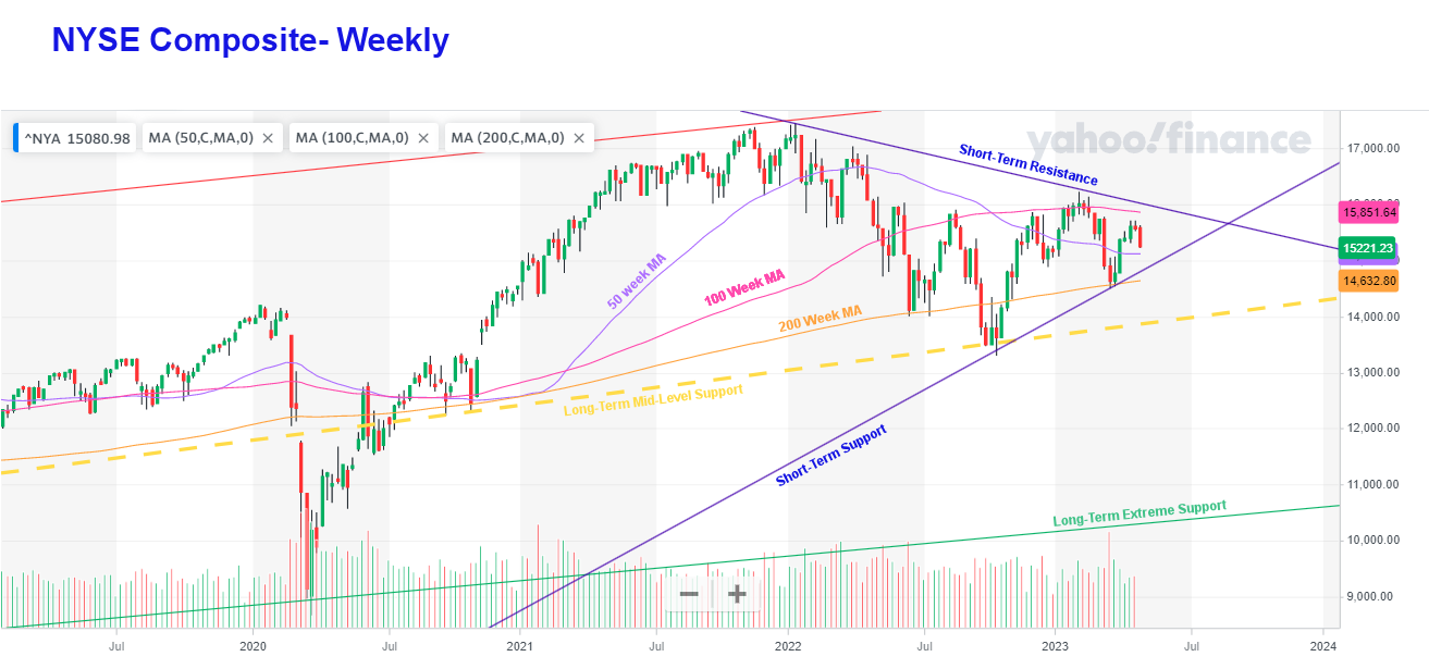 Remember this is a weekly chart, so there are several weeks left before the index reaches the endpoint. But when it does, we may see a small fake in one direction followed by a big move in the opposite direction.
The big problem with trendlines and support lines is choosing where to draw them. Of course, the more points you have to connect, the better. And the longer the term covered, the more reliable. In this chart, we’ve redrawn the support line out to the 2020 low, which gives the index a little more wiggle room before reaching the tip of the pennant, but the effect is still the same.
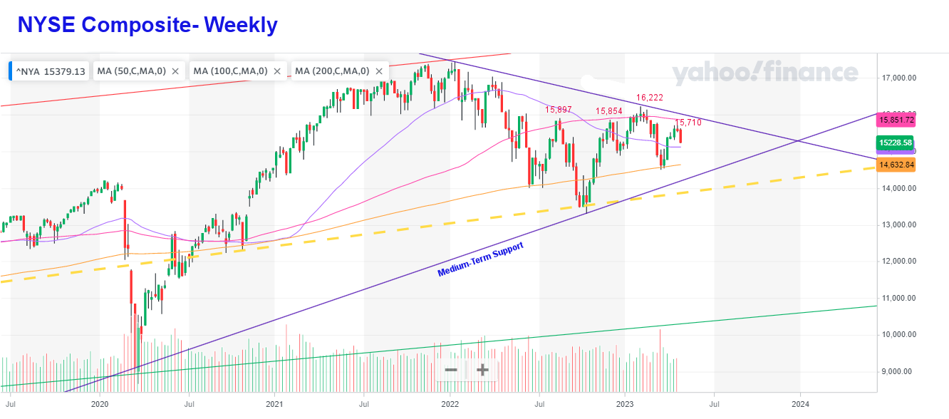
We’ve also added the recent peaks. The first one is August 15, 2022, at 15,897. The next peak was slightly lower at 15,854 in November 2022. A lower high generally indicates a falling market. But then the NYSE made a higher high at 16,222 which could indicate that the bottom was in when it touched the medium-term support line. But then the recent peak came in lower than the first two peaks giving us a warning sign again.
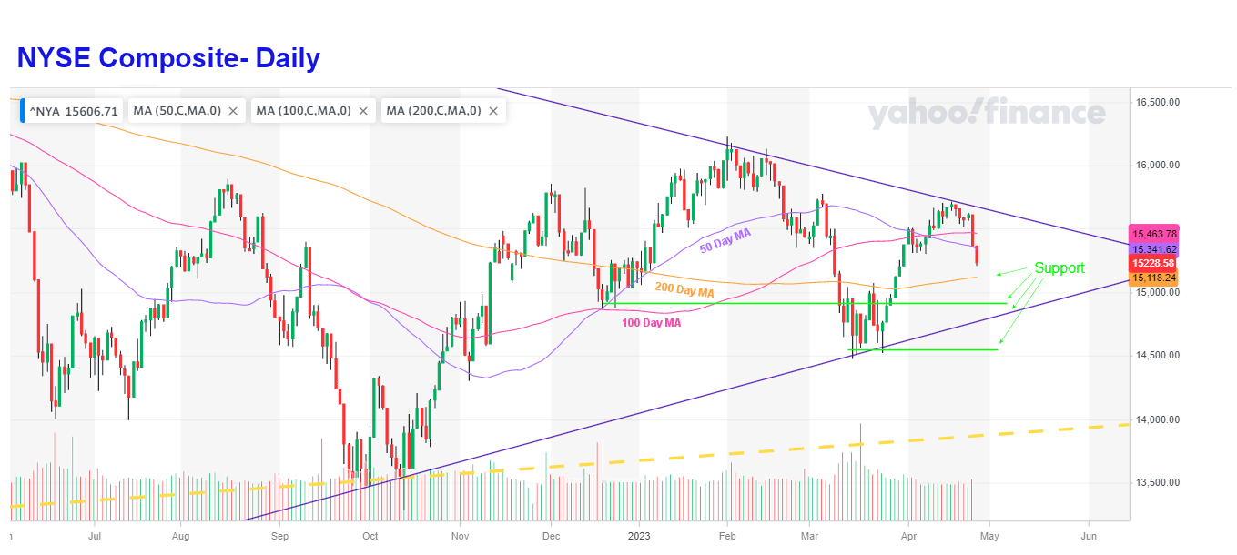
Other negative indicators on the first chart are the 50-week moving average falling below the 100-week average, indicating that over a one-year timeframe, the trend is down.
NYSE Daily
Looking at the daily chart, we see that the 50-day trend is also down, although the 100-day average is flat to slightly up. The 50-day average is also below the 100-day moving average. The index itself has had two very strong down days taking the index below both the 50-day and 100-day moving averages. However, it is still above the 200-day average. And there are still 4 levels of support between here and 14,500. They include the 200-day moving average, previous lows, and the blue short-term support line