In the following article Chris Ciovacco looks at a variety of indicators to determine the probability that the market will take a dive in the near future. He’ll look at New Highs vs. New Lows, and compare market vulnerability of the 2011 market compared to today. The good news is that despite the beating the retail sector took with Macy’s down 17% the probability of a market crash is still low.~Tim McMahon, editor
Are The Bears Making Progress Behind The Scenes?
New Highs – New Lows
Market breadth speaks to the number of stocks participating in an advance. Healthy markets tend to have positive market breadth. The chart below tracks the number of NYSE stocks making new highs minus the number making new lows. Unlike the present day, bearish divergences were clearly visible in both 2000 and 2007 as shown on April 26.
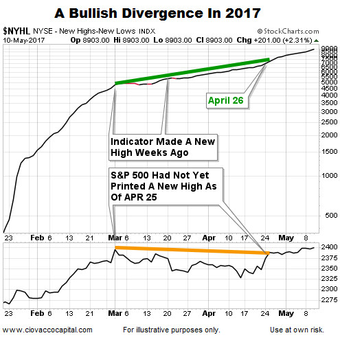
Since the S&P 500 posted a new closing highs on May 5, the chart above helps us assess the odds of a sharp and sustained reversal in stocks relative to the odds of a continuation of the existing bullish trend. As of this writing, there are no red flags on the chart above. Breadth helps with the intermediate-term (weeks), rather than the next few minutes, hours, or days.
Why Stocks May Surprise On The Upside 2017-2022
This week’s video covers 20 charts that make the case for better than expected outcomes in the stock market over the next five years.


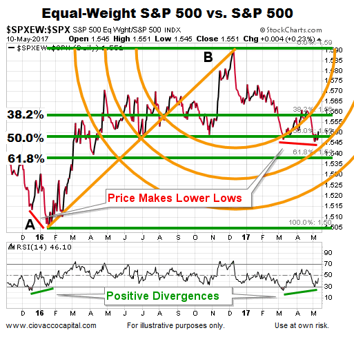
Equal-Weight S&P Underperformance
A May 2 post covered the recent underperformance of the Equal-Weight S&P 500 Index relative to the S&P 500 Index (cap-weighted). Thus far, the pullback in the Equal-Weight/S&P 500 ratio has stayed within the “normal retracement” zone as shown via the three Fibonacci levels below. If the ratio can hold near the three major Fibs, the odds of a higher high will remain in the favorable range. If the ratio drops below and stays below the three major Fibs, the odds of a trend change or deeper pullback will increase. The chart below shows numerous and potentially helpful concepts described in detail in this video clip.
How Vulnerable Is 2017 vs. 2011?
With the S&P 500 losing upside momentum in recent weeks, it is prudent to assess the odds of a waterfall plunge occurring in the coming days. In 2011, a 15% plunge occurred between the close on July 28 and the intraday low made on August 9.
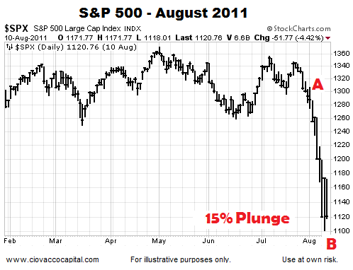
The following charts provide some insight into the health of the present day market relative to the market’s health in 2011 before the waterfall plunge. Markets can do anything at any time. Having said that, waterfall plunges typically do not come without some type of observable deterioration already in place.
How Much Damage Was In Place Before The 2011 15% Plunge?
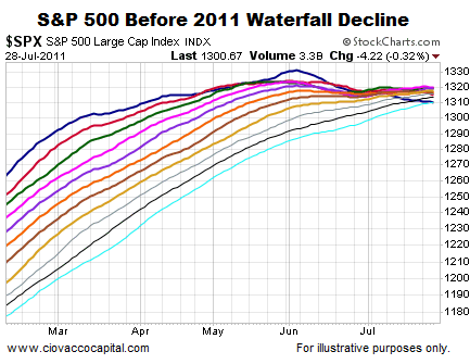
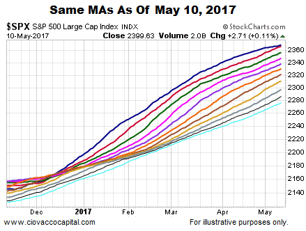
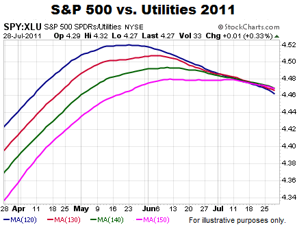
Moving averages help us monitor the never-ending tug of war between bullish conviction and bearish conviction. Remember, the plunge in 2011 occurred between the close on July 28 and the intraday low on August 9. The chart below shows various daily moving averages for the S&P 500 on July 28, 2011; the moving averages range from the 50-day (dark blue) to the 150-day (teal). Notice how the 50-day moving average peaked two months before the waterfall decline. The fastest moving average had also moved from the top of the cluster to the bottom of the cluster, which spoke to the magnitude of the deterioration in bullish conviction relative to bearish conviction. Also notice how tight the cluster of moving averages were on July 28, and how many of the slopes had moved from positive to neutral or negative.
The 2017 chart below allows us to compare and contrast the exact same moving averages as of May 10. Instead of making a new high months earlier, the dark blue 50-day moving average is still making new highs. Unlike the tepid slopes in 2011, the slopes of all the moving averages in 2017 look much healthier from a bullish conviction relative to a bearish conviction perspective. In 2011, the 50-day had migrated to the bottom of the moving average cluster; today, the 50-day remains firmly on the top.
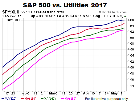
Income-Oriented Utilities vs. S&P 500
Common economic sense says the conviction to own income-producing utilities would increase as economic fear increases, which is exactly what happened in 2011. The long-term trend was starting to weaken in favor of defensive utilities over two months before the S&P 500’s plunge in late July/early August.
Are similar red flags waving in May 2017? The answer is not yet. The long-term trend turned in favor of the S&P 500 back in November 2016 and remains constructive for the S&P 500 looking out weeks, months, and years. These charts do not speak to the next few minutes, hours, or days.
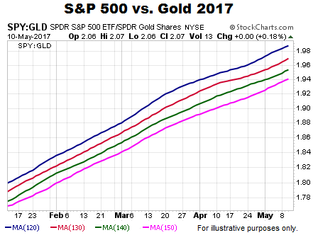
Stocks vs. Safe Haven Gold
When fear picks up, especially long-term fear, the demand for safe haven gold typically increases. The script was followed in 2011 with the long-term trend starting to flip in favor of gold well before the S&P 500 rolled over.
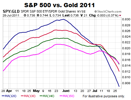
Is gold waving similar “the long-term trend in stocks needs to be watched very closely” signals on May 10, 2017? The answer is not yet.
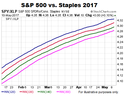
S&P 500 Relative To Defensive Staples
If we examine the S&P 500 relative to defensive-oriented consumer staples, we see similar trend deterioration in 2011 before the waterfall decline
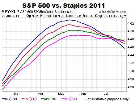
If large money managers were concerned about the long-term outlook for stocks, we would expect to see the conviction to own consumer staples increase relative to the conviction to own the broader S&P 500. It may happen, but it has not happened yet.
How Does All This Help Us?
The charts above help us assess the probability of good things happening relative to the probability of bad things happening. The probability of bad things happening never drops to zero.
If the Equal-Weight/S&P 500 ratio rallies above the three major Fibs, the probability of good things happening will start to improve. Conversely, if the ratio drops below and stays below all three major Fibs, the probability of further weakness in the broader stock market will increase.
Differences in asset class behavior and trend strength between July 28, 2011 (before the plunge) and May 10, 2017 tell us the present-day market has a higher tolerance for risk and stronger trends, which speaks to probabilities associated with pullbacks, the magnitude of pullbacks, and the duration of pullbacks. If the charts begin to shift in a meaningful way, the probabilities will shift as well.

This article by Chris Ciovacco of Ciovacco Capital Management originally appeared here and was reprinted by permission.