Central banks around the world are raising interest rates in an attempt to reign in inflation after having thrown the equivalent of Nitro into the inflationary fuel tank. As we predicted, this is resulting in an epic market crash in the making. Unlike in 2008, however, this one seems to be unfolding in slow motion. The following chart is the same one we’ve been showing every month along with our NYSE ROC commentary. It is the long-term NYSE weekly chart. On it, we can see that this year so far, the index has fallen from the peak at the long-term resistance line down to the mid-line (as we said it would). So as the headline suggests, we are now halfway to the worst-case scenario, i.e., all the way down to the long-term support line. Whether it gets that bad or not remains to be seen.
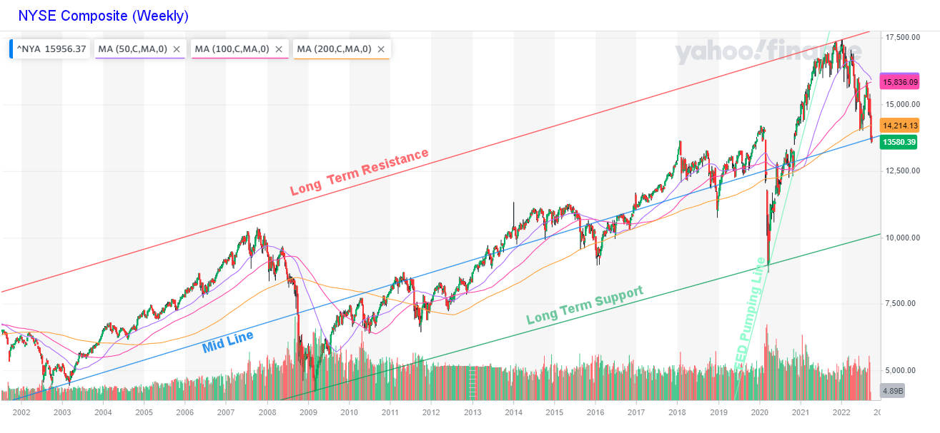 What we do know is that the 50-week moving average (purple line) has rolled over and is about to cross below the 100-week moving average, which will signal a definite bear market. The light green line (i.e., the runup from the COVID-induced bottom) is primarily the result of FED money pumping. The excess liquidity fed the stock market, creating a sort of euphoric alter-ego to the COVID fear-mongering. But as we’ve been saying, when the money flow stops, everyone rushes for the exits, and the market comes tumbling down.
It is interesting o note that we have reached this mid-point line at the same level as the peak in January 2018, so there are two layers of support, i.e., the mid-line and the January 2018 peak level. Neither is particularly strong support, so we expect it will eventually break through, but we could see a minor rally off-this support level. We saw that a couple of months ago when the index touched the 200-week moving average (yellow line) and then rebounded, failed to make a higher high, and then started falling again.
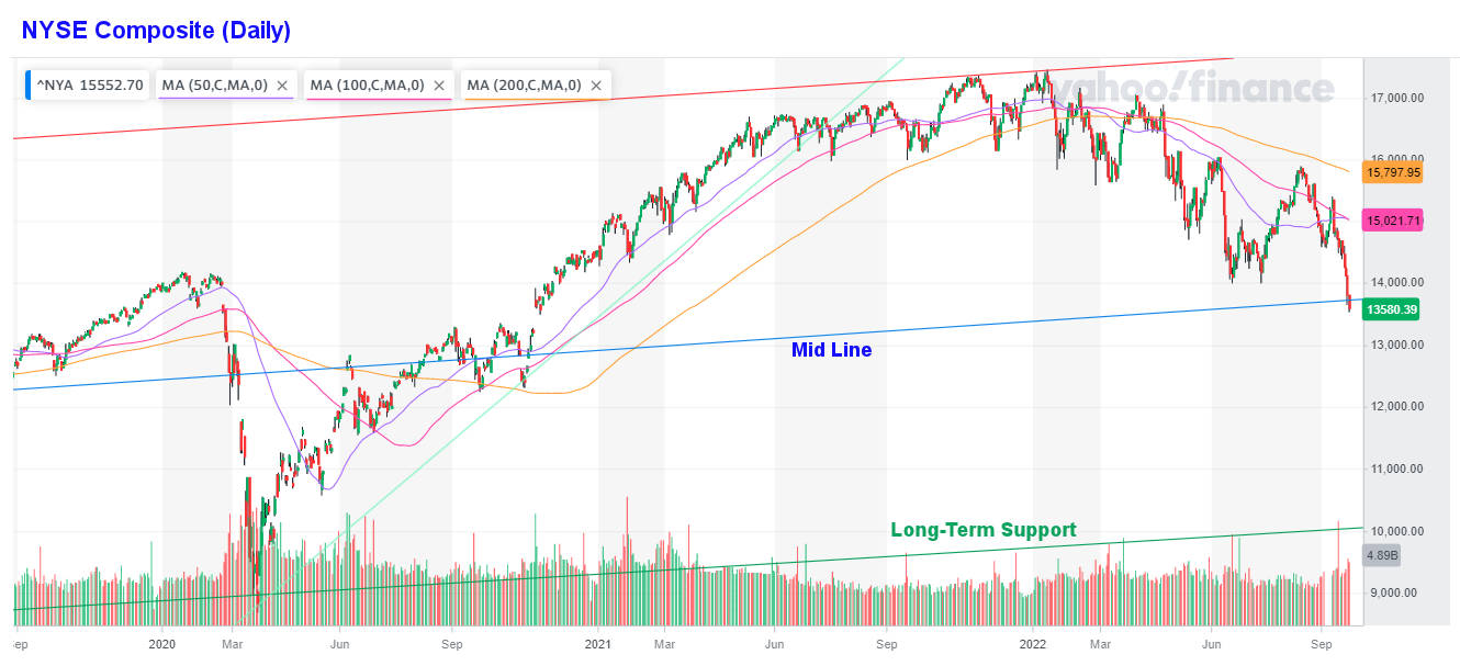
NYSE Daily Chart
Looking at the Daily Chart, we see that early in 2022, the 50-day moving average crossed below the 100-day average and then the 200-day. Then even though the market rebounded, the 100-day average crossed below the 200-day average. So as early as April, it was obvious that we were in a down-trending market. At the moment, the recent upward spike has caused the 50-day average to level out and test the 100-day average. If it were to cross above it, that would be a positive sign. But the recent drop should drag the 50-day average downward again. The 14,000 level was a key psychological level as a peak in early 2020 and as a double bottom in June/July of this year. So crossing below that level now is an important point and it would act as resistance should the market rebound upward.
The Ultimate Bottom
Looking back at the Weekly chart for a moment, we can see that the two points defining the long-term support line are the 2009 and 2020 bottoms. Both were extremely severe corrections (crashes), and we don’t necessarily need to go all the way down there for this correction to end, but it is a distinct possibility due to the extraordinary nature of the money pumping that we saw. As we’ve been saying for a while, 12,000 is likely, but just over 10,000 is still within the realm of possibility.