How can the economy be booming if so many people feel broke?
 Every day, the headlines celebrate another market milestone. AI companies are spending hundreds of billions on cutting-edge infrastructure, investors are pouring money into the next technological revolution, and private firms like SpaceX continue to attract billions in fresh capital. To anyone watching Wall Street, America looks like it’s in the middle of an economic renaissance.
But step outside the boardroom and onto Main Street, and the picture changes dramatically.
Families are struggling to keep up with grocery bills, rent, insurance, and healthcare costs. Many workers are taking on second jobs or gig work just to stay afloat, while credit card balances and household debt continues to climb. For millions of Americans, the prosperity touted in financial headlines feels like it belongs to someone else.
That’s not a contradiction; it’s the defining feature of what’s known as the K-shaped economy: one path leading upward for those with assets, investments, and in-demand skills, while another points downward for households facing rising costs and financial strain.
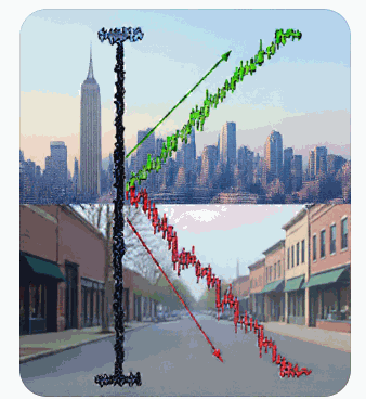
So What Exactly Is a K-Shaped Recovery?
Picture the letter K. One arm shoots up and to the right. The other arm slides down and to the right. Now imagine that’s not a typography lesson; it’s your economy.
A K-shaped recovery describes a situation where different segments of the population experience completely opposite economic trajectories. One group, usually higher earners, asset owners, and certain industries, keeps climbing. Another group, usually lower and middle-income earners, falls further behind. Both trends happen simultaneously, in the same economy, often reported in the same GDP number.
This is different from the recoveries we grew up hearing about. A V-shaped recovery means everything crashes, and then everything bounces back together. A U-shaped recovery means a slower, more drawn-out version of the same thing. An L-shaped recovery means things crash and just… stay down. All three of those describe a single shared experience.
The K is different because it splits the experience in two. There is no “shared” anymore. There’s a top half and a bottom half, and they’re moving in opposite directions.
Where Did This Term Come From?
The phrase picked up steam during the COVID-19 recovery. While white-collar workers shifted to remote work without missing a paycheck, and tech and asset markets soared on stimulus money and low rates, service workers, hourly employees, and small business owners got hammered. Restaurants closed. Retail jobs vanished. Meanwhile, home prices and stock portfolios went vertical.
But here’s the thing: the K-shape didn’t start with COVID, and it didn’t end when the pandemic did. It’s arguably just a more visible label for a divergence that’s been building for decades, and it’s still very much with us today.
What a K-Shaped Economy Looks Like in 2026
Let’s get concrete, because abstractions don’t pay your bills. Here’s what the two arms of the K tend to look like right now.
The upper arm:
- Asset owners (stocks, real estate, private equity) benefit as markets climb
- High-income professionals see strong wage growth and job security
- Companies serving affluent consumers- think luxury goods, premium travel, high-end real estate- report robust demand
- Large corporations with pricing power pass costs to consumers while protecting margins
The lower arm:
- Wage growth for lower and middle-income workers lags behind inflation
- Renters get squeezed by housing costs while homeowners benefit from equity gains
- Discount retailers and “trade-down” brands report surging traffic as budget-conscious shoppers pull back
- Credit card balances and delinquencies climb as households lean on debt to cover the gap
- Small businesses without pricing power get squeezed between rising input costs and price-sensitive customers
You can see this divergence in how companies report earnings. On the discount end, the trade-down trend is accelerating in a measurable way: Dollar General reported a same-store sales increase of 2.0% in Q1 2026, and private label products are growing three times faster than national brands industrywide, with 71% of shoppers now saying store brands are equal to or better than name brands. Dollar Tree is expanding aggressively into wealthier zip codes precisely because higher-income shoppers are showing up at discount stores in growing numbers and the share of households earning over $170,000 shopping at discounters jumped from 20% to 28% in just four years. Meanwhile, the high-end of retail has held up comparatively better, though not without cracks. Louis Vuitton (LVMH) modestly beat full-year 2025 earnings expectations, but its key fashion and leather goods division saw sales fall 3% and chairman Bernard Arnault flatly warned that “2026 will not be easy.”
The picture that emerges is less “luxury is booming while discounters struggle” and more “discounters are pulling in customers from every income level while even the luxury stalwarts are navigating real headwinds.” The K is there, but it’s messier than the clean narrative suggests. The biggest gains are in a very narrow section of Tech/AI stocks.
Why is This Happening?
A few forces tend to drive and reinforce the K-shape:
Asset ownership is unevenly distributed. If your wealth is mostly in a paycheck, inflation and rate hikes hit you directly. If your wealth is mostly in assets, those assets often keep appreciating regardless of what’s happening to everyday wages, especially when monetary policy stays accommodative or markets price in rate cuts.
Inflation isn’t experienced equally. Headline inflation numbers get reported as a single figure, but the actual basket of goods that matters to a household earning $40,000 a year (rent, groceries, gas, childcare) often inflates faster than the basket that matters to a household with significant investment income. “Inflation is cooling” can be true in the aggregate while still feeling false at the checkout line for the bottom half of earners.
Labor market bifurcation. Industries requiring specialized skills, particularly in tech, finance, and certain professional services, have commanded outsized wage growth. Meanwhile, many service and retail positions have seen wage gains eaten alive by living costs.
Corporate pricing power. Big companies with strong brands and limited competition can raise prices and protect margins even when consumers are stretched. Smaller players without that pricing power either eat the cost or lose customers. Either way, they’re more exposed to a slowing lower arm of the K.
What It Means for You
This isn’t just an academic talking point. It has real implications depending on where you sit.
If you’re an investor: Don’t assume “the economy is fine” because the S&P is at a record high, and don’t assume “the economy is in trouble” because consumer sentiment surveys look grim. Both can be true at once. Pay attention to which companies are positioned on which arm of the K. Consumer discretionary names catering to high earners may keep performing well even as broader consumer sentiment sours. Conversely, companies dependent on the broad middle-class consumer may struggle even in a “growing” economy.
If you’re a consumer: If your personal experience doesn’t match the headline economic narrative, you’re not failing to understand economics, you’re living in the bottom arm of the K. That’s useful information for budgeting decisions: it may mean leaning more conservative on debt, building cash reserves, and being skeptical of “the economy is strong” headlines when making major financial decisions like home purchases.
If you’re a business owner: Know which arm of the K your customer base sits on. Selling to the upper arm means demand may stay resilient even in a slowdown, but you need to deliver real value or exclusivity to justify the spend. Selling to the lower arm means you need to watch for trade-down behavior, increased price sensitivity, and potential demand softness even when GDP headlines look fine.
If you’re trying to understand politics and policy: The K-shaped economy helps explain a lot of the disconnect between official economic data and public sentiment. When politicians point to GDP growth or low unemployment while a large share of the population feels like they’re falling behind, the K-shape is often the reason both things are true at once.
The Bottom Line
The K-shaped economy is really a story about averages lying to you. GDP, the unemployment rate, and stock market indices are aggregate numbers, and aggregates can mask enormous divergence underneath. When someone tells you “the economy” is doing well or doing poorly, the more useful question is: for whom?
Understanding the K-shape won’t fix the divergence, but it will make you a sharper reader of economic headlines, a more realistic investor, and a more informed citizen. The next time the data and your daily life seem to disagree, remember: you might just be standing on a different arm of the K than the headline writer.