In today’s article we look at, what effect do the three “D’s” debt, deficits, and demographics have on the economy? Do different generations have different expectations based on the economic environment they grew up in?
The past 60 years—which we think of as “normal”— enjoyed a demographic tailwind which we can quantify. It was worth about 1% per year, meaning that, if we think of 3% growth as normal, it’s really 2% growth plus a demographic tailwind of 1%… The coming decades—due to the rising support ratios from the aging boomers—will experience a demographic headwind of roughly the same 1%. So, if 3% growth was normal, 1% growth becomes normal. This is the reason behind my concerns regarding the legacy of monetary and fiscal experiments, and debt and deficits we leave our children. ~ Tim McMahon, editor
 Mind the (Expectations) Gap: Demographic Trends and GDP

By Rob Arnott and Denis Chaves
A large body of research in psychology and economics shows that human beings tend to form their expectations by relying on past experiences—especially recent ones. Malmendier and Nagel (2011), for instance, talk about investors who live through long periods of poor stock market performance and how this experience affects their risk-taking propensities… for life. The most famous example comes from the “Depression Babies,” an entire generation that was scarred for life by the financial and macroeconomic shocks of the Great Depression. Of course the opposite effect also exists: periods of economic ebullience give rise to more intrepid investors, entrepreneurs, and so on.
Those times might feel like a distant past now, but until recently 3–4% growth in real GDP was considered “normal.” So it should come as no surprise that the economic performance of the past few decades has strongly influenced expectations about economic growth. However, when optimistic expectations get detached from reality we risk creating a significant expectations gap—a disconnect between what we take for granted given our recent experiences and what we should anticipate given simple arithmetic.
We explore the role of demography—one of the three Ds of the 3-D hurricane of debt, deficits, and demographics—on economic growth in this issue of Fundamentals.2 The following synopsis of our forthcoming paper on the topic (Arnott and Chaves, 2013) demonstrates that favorable trends in the size and composition of populations have helped to fuel the rapid economic growth experienced in the developed world over the past 60 years, and their reversal plays a crucial part in the current rapid deceleration in developed world growth.
Demographic Evolution
Tracing very long term trends will certainly help situate existing and emerging demographic states of affairs in their historical context. It may also indicate what used to be “normal,” if, indeed, there ever was such a condition. We examine four distinct phases that represent past, current, and future population profiles across different countries:3
Phase I. The first phase, covering most of human history, was ostensibly a high-mortality steady state, with births roughly matching deaths, short lifespans, and elevated support ratios (the number of non-workers, young and old, supported by the labor force). Life in this phase can probably be described best by Hobbes’ famous quote as “solitary, poor, nasty, brutish, and short.”4
Phase II. This phase, beginning around the time of the industrial revolution and climbing to a pinnacle in the decades after the Second World War, was characterized by a steady rise in life expectancy and a decline in birthrates. The working-age population soared and support ratios improved enormously.
Phase III. This phase, beginning in the present century, is almost an inverted image of the second phase: the fraction of seniors skyrockets and the fraction of workers tumbles. Until fertility rates get back to replacement levels (roughly 2.1 children per woman of child-bearing age), the population crests and begins to subside, with very high support ratios associated with senior citizens. However, this should not come as a surprise, because both phases II and III are impelled by the same forces: rising life expectancies and falling fertility rates.
Phase IV. This phase is the “future state,” which is by definition somewhat speculative. For convenience, we model it as a new steady state with births equaling deaths, and with long lifespans, perhaps much longer than today’s. We include it for the purpose of comparison; since phases II and III are unquestionably temporary, it must differ from them.
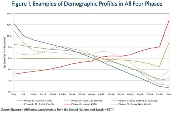 The demographic profiles for each phase are illustrated in Figure 1. The solid blue line shows the profile of one of the first reasonably accurate demographic tables, produced by Edmond Halley for the city of Breslau (currently Wroclaw in Poland) in 1693.5 Not surprisingly, mortality rates were much higher than they are today. In particular, infant mortality was so high that there is an inflection in the curve right after age group 0–4: many newborns didn’t last a single year, let alone five. Median life expectancy was only 24 years at birth, but 34 for those fortunate or hardy enough to survive that first lethal year.6 From our perspective, phase I is a “steady state”; through the lens of our telescope, population structures were relatively stable for centuries. Obviously, for someone living through famine, wars, or decimating diseases, life was anything but stable.
The second phase is represented by the green lines, which depict two distinct points in U.S. history—1950 and 2010— and the average for the intervening period. It is possible to see the peak of the baby boomers in 1950 (dashed line) and the subsequent increase in the relative size of the working force in 2010 (dotted line). In these six decades, tumbling support ratios provided a strong tailwind to economic growth, as children fell relentlessly to historical lows as a share of the population, the working-age population soared, and support ratios for senior citizens remained low. Interestingly, the dotted line for 2010 becomes almost flat up to approximately age 50, reflecting the combined effects of lower mortality rates and the transition to a new steady state (phase IV).
As an extreme example of the strong demographic imbalances which are developing in some countries, the red line presents the forecasted demographic profile for Japan in 2050. The slope of the curve is completely reversed, revealing a discouragingly small number of children and an astonishingly large number of senior citizens.
Finally, the gold line shows an example of a demographic profile of a hypothetical country with a life expectancy of 80 years (approximately the life expectancy for the developed economies of the world at the present time). This phase will be characterized by support ratios that are both higher than the demographic tailwind of recent decades and lower than what we expect in the coming phase III decades.
Economic Growth
As interesting as studying historical and prospective demography might be, such an analysis would be incomplete if we did not consider the future prosperity of different countries in view of their past, current, and future demographic profiles. For this reason, we combine the rich trove of past and forecasted future data from the United Nations with our previous work establishing a link between demographic profiles and economic growth. Figure 2, drawn from Arnott and Chaves (2012), shows the relationship between the size of each age group and growth in Real Per Capita GDP.
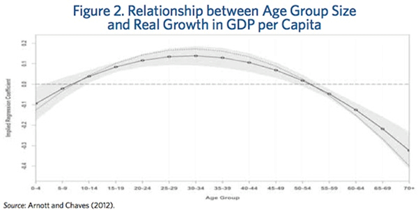 Our results show that children have a slightly negative effect on economic growth, but young adults start to positively contribute as they join the workforce. Skeptics might argue that wages and productivity peak later in life, typically in one’s 40s and 50s. This is generally true, and helps to explain why the most prosperous nations often have a larger proportion of mature adults than the less prosperous nations. However, the definition of a peak, whether for productivity or anything else, is that we stop rising and start falling! When we reach peak productivity, by definition our productivity growth is zero.
The average contribution to GDP growth becomes negative between 55 and 60. This does not mean that people begin to consume more GDP than they produce after age 55, only that—on average—workers above age 55 have passed their peak in productivity. Intuitively, the average 60-year-old is more productive than the average 40-year-old, but not so relative to the average 55-year-old. At ages 60 and above, the coefficients decline much more sharply: the mature worker exhibits falling productivity, and in retiring, a worker’s productivity simply falls off a cliff.
The influence of demography on economic growth should not be underestimated. Our research shows that demography contributed to a tailwind in Phase II and will likely contribute to a headwind in Phase III. Figure 3 presents the results for the countries of the G-8 and the BRICs. We forecast growth in Real Per Capita GDP (holding everything else constant) for every five-year interval between 1950 and 2050, based on the demographic linkages observed in the 1950–2010 data spanning 22 countries. These are not “normal” GDP growth rates, they are abnormal GDP growth rates, reflecting the impact of a demographic tailwind or headwind.
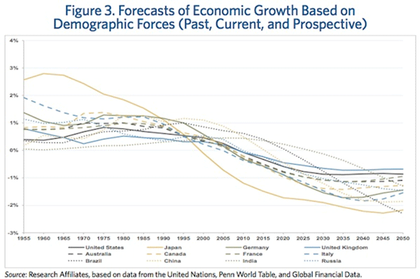 Japan displays the most manifest effects. The Japanese “economic miracle” of the 1960s to the 1980s got a terrific lift from demography. The birthrate plunged, so that support ratios associated with legions of children disappeared, and the support ratios associated with legions of senior citizens did not really outstrip the decline in the roster of children until the 1990s. Their demographic “dividend” may have peaked at approximately 3% per year, relative to the average demographic profile of the century from 1950 to 2050.
Now, the youngsters of the late 1940s and early 1950s are approaching retirement, and the baby bust from about 1980 onward is delivering a continually shrinking roster of new entrants to the labor force. With relatively few young workers to take the place of retiring boomers, Japan’s prospective demographic headwind may be greater than 2% per year. A transition from a 3% tailwind to a 2% headwind is shocking: it suggests a 5 percentage point drop in normal real per capita GDP growth rates from the heady growth of the 1960s to the 1980s. Even if changes in policies and entitlements can halve these figures, it’s a formidable headwind.
All 12 countries will confront varying speeds of demographic headwinds in the coming decades, first in the developed economies, then in the older emerging economies (China and Russia), and finally in the younger emerging economies (Brazil and India). These headwinds get stronger over time and appear to stabilize in the developed world and the older emerging economies only after about 2040. For the younger emerging economies, the demographic headwinds do not become acute for perhaps another 20–30 years.
All 12 countries enjoyed demographic tailwinds during the past 60 years, so these headwinds will feel more obstructive than they are. It is human nature to consider our personal experience to have been “normal,” so we evaluate subsequent events in comparison with this self-referential “norm.” If the people of Japan consider the former tailwind of 2–3% to be “normal,” then a future 2% headwind will feel like a ponderous 4–5% drag, relative to expectations. On average, the countries in this analysis enjoyed benign demographic profiles that boosted GDP growth by around 1% per year during much of the past six decades.
The first few decades of the sample were particularly beneficial to developed countries. China and Brazil seem to have experienced their peak demographic dividend recently. That said, a 2% erosion in high-single-digit growth is hardly a pessimistic forecast. Absent egregious policy missteps, these economies have ample room to catch up to the developed world, albeit at a gently decelerating pace. The young emerging economies, like India (where the median age today is still only 25), will continue to enjoy a demography-fueled tailwind over the next decade or two.
Conclusion
Our main goal in presenting these results is to correct the common misconception that developed countries went through a “normal” period of high growth, as if we are all entitled to fast-growing prosperity. In reality, the developed world is entering a new phase in which the low fertility rates of past decades lead to slow growth (in many countries, no growth) in the young adult population; young adults are the dominant engine for GDP growth. Mature adults, many of whom are at or near their peak productivity, are poised to retire, creating an impressive surge in the rolls of senior citizens. These newlyminted senior citizens, transitioning from near-peak productivity to retirement in a single step, will be drawing on the economy while no longer producing goods and services. The unequivocal good news of a steady rise in life expectancy means that these retirees will create a very substantial drag on GDP growth, as these seniors move from peak productivity to negligible productivity in just a few years.
The danger is not in the slower growth.
Slow growth is not a bad thing. It’s still growth. The danger is in an expectations gap, in which we consider slower growth unacceptable. If we expect our policy elite to deliver implausible growth, in an environment in which a demographic tailwind has become a demographic headwind, they will deliver temporary outsized “growth” with debt-financed consumption (deficit spending). If we resist the necessary policy changes that can moderate these headwinds, we risk magnifying their impact.
Endnotes
1. The title is borrowed from Russel Kinnel’s wonderful Morningstar research, repurposed to our demography topic.
2. See past issues of Fundamentals for more on the 3-D Hurricane.
3. This choice of four phases might not come from traditional demographic theory, but it serves our purposes of illustrating the transitions most countries are recently experiencing.
4. Hobbes, Thomas. 1651. Leviathan, or the Matter, Form, and Power of a Commonwealth, Ecclesiastical and Civil. London: Andrew Crooke.
5. According to Bacaër (2011), before the 18th century it was common to publish bulletins with baptisms and burials that contained the cause of death—mainly to inform citizens about plague epidemics—but not the age of death. For this reason, most tables produced involved a significant amount of guesswork to estimate the age of death from the cause of death.
6. Halley himself won the actuarial lottery of the 17th century, reaching age 85. His own tables gave him a 1.4% chance of living so long.
References
Arnott, Robert D., and Denis B. Chaves. 2012. “Demographic Changes, Financial Markets, and the Economy.” Financial Analysts Journal, vol. 68, no. 1 (January/February):23–46.
———. 2013. “A New ‘New Normal’ in Demography and Economic Growth.” Journal of Indexes (forthcoming).
Bacaër, Nicolas. 2011. A Short History of Mathematical Population Dynamics. London: Springer Verlag.
Malmendier, Ulrike, and Stefan Nagel. 2011. “Depression Babies: Do Macroeconomic Experiences Affect Risk Taking?” Quarterly Journal of Economics, vol. 126, no. 1 (February):373–416.
Like Outside the Box?
Sign up today and get each new issue delivered free to your inbox.
It’s your opportunity to get the news John Mauldin thinks matters most to your finances.
See Also:
- Why is the US Federal Government Afraid of Deflation?
- The Housing Bubble Revisited
- The US Government Is Bankrupt